A fully transparent expected-goals model
See this GitHub repository for all code produced for this project.
Introduction
“Expected Goals” (xG for short), is a widely used metric among soccer analysts and fans alike. In fact, the idea of xG has infiltrated the mainstream in recent years, to the point where now, even most casual fans have probably heard of the term. The xG metric essentially describes how many goals we’d expect a team to score based on the chances it creates. Each shot a team takes can be assigned an xG value, ranging from 0 to 1, which represents the probability of that shot resulting in a goal. The xG metric helps provide objectivity in the analysis of a soccer match, since actual score lines can often be misleading given that luck plays such a large role in the game.
This blog post serves as a comprehensive overview of an xG model I created using Statsbomb’s public data. More specifically, the model is created using data from Barcelona’s La Liga matches from 2004 to 2016.
Data exploration
Before thinking about the model, let’s take a look at the data. The data used for this project is stored in json files on Statsbomb’s public data repository on GitHub. The first step was extracting the information related to all the shots taken in Barcelona’s La Liga matches from 2004 to 2016. I wrote a python script to do this, which can be found here. The next step was turning this information into useful variables that could be used to train a machine learning model - so-called “feature engineering”. Some of the information which came directly from the json files was useful “out-of-box”, such as the x and y coordinates on the pitch from which the shots were taken, but other information needed to be manipulated to extract useful features (note: features, for less technical readers, is just another commonly used term for variables in machine learning). For example, most of the shots come with a “freeze frame”, which contains the location on the pitch of each player when the shot was taken. I used this information to extract two features: the number of players between the shot location and the goal, and the number of opponents within a 5 yard radius of the shot location. In all, the final shot features are listed below:
- outcome: result of the shot (Goal or not Goal)
- play pattern: pattern of play which led to the shot
- x start location: x-location of the shot
- y start location: y-location of the shot
- distance: distance from the shot location to the center of the goal
- technique: technique with which the shot was hit
- first time: whether the shot was hit first time or not
- x gk position: x-location of the gk when the shot was taken
- y gk position: y-location of the gk when the shot was taken
- type of shot: whether the shot was from open play or from a set piece (with type of set piece specified)
- num opponents within 5 yards: number of opponents which were within 5 yards of the shot location
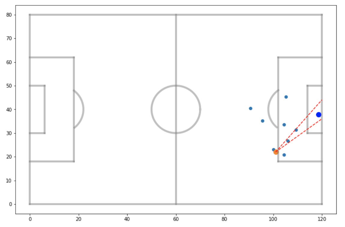
- num opponents between shot and goal: number of opponents which were between the shot location, and the lines connecting the shot location and the two posts
The last feature listed above is best understood by looking at the visualization below. The intuitive idea behind it is that more opponents crowding the area infront of a shot should theoretically make that shot less likely to result in a goal. In this case, the shot shown would be given a value of 2 for this feature.
Visualizing relationships
With the shot features extracted, I performed some data visualization to get a sense of how each variable affects the probability of a shot resulting in a goal. This sort of exercise is useful as it provides insight into the data, and sets us up to better understand the models we will eventually create. Let’s first look at how the distance from which the shot was taken affects the goal scoring rate.
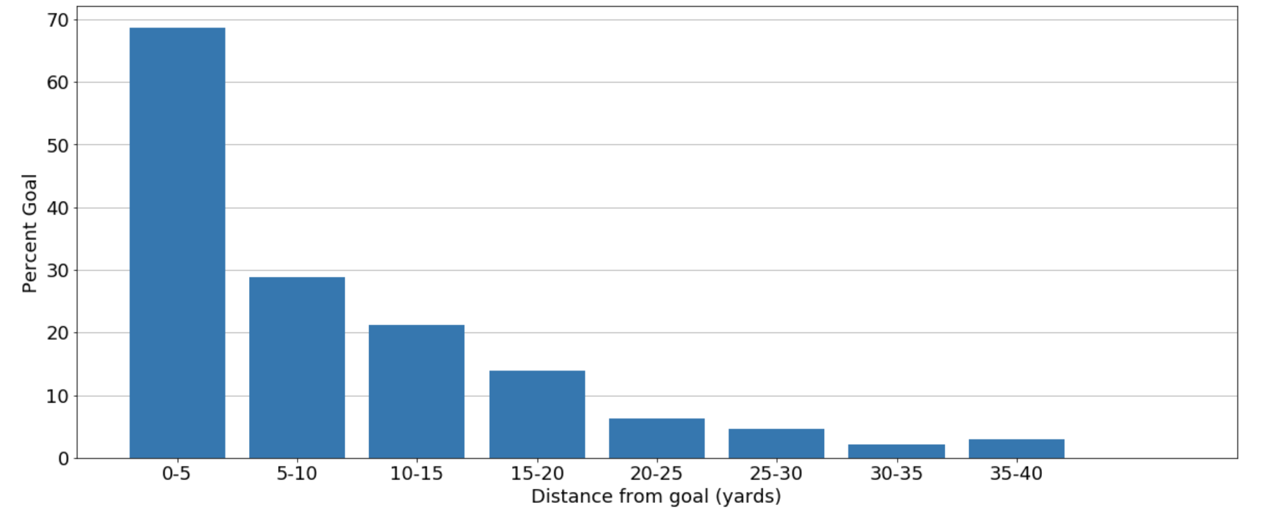
We can see, unsurprisingly, that the further away a shot is taken, the less likely it is to result in a goal. However, we can also see that the relationship appears to be non-linear, and so a model capable of capturing non-linear relationships may perform best for predicting expected goals. Next, let’s look at how the play pattern which led to the shot affects the goal scoring rate.
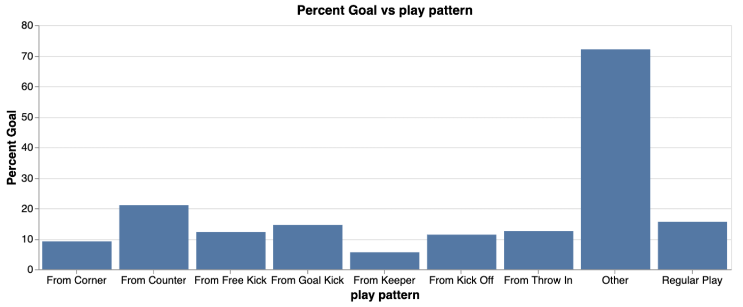
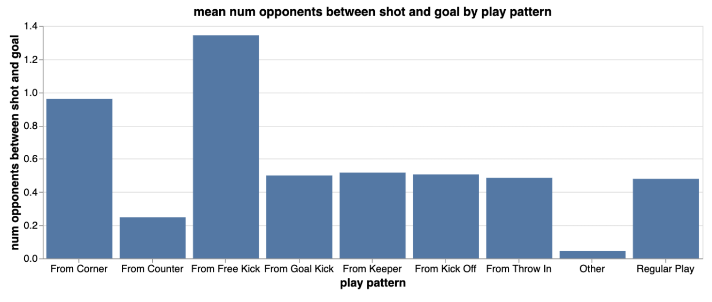
Here, we see that “other” (penalties) result in goals about 70% of the time. The next best play pattern is counter attacks, where we see that shots from counters go in over 20% of the time. So it seems like shots from counters are of higher quality than shots created from other play patterns. The visualization below may explain why this is the case, where we see that on average, there are less opponents between the shot location and the goal for shots created from counters. This makes sense since many opposition players would be out of position in counter attacking situations.
These are just a few of the shot feature relationships I visualized. For a more comprehensive exploratory data analysis, see this jupyter notebook.
Training models
We are now ready to take a look at the actual expected-goals model. This section goes deeper into the actual machine learning, and so less technical readers may wish to skip straight to “A closer look at the models”. In short, I actually produced several models based on different algorithms. The first was a logistic regression model, which relates the probability of a specific event (like a goal) to the predictor variables. The other models were “tree-based” algorithms, which essentially make decisions by asking successive questions like “Was the shot taken from more than 20 yards? If yes, it probably didn’t go in. If not, were there opponents near the ball when the shot was taken? Was the goalkeeper out of position?, and so on.
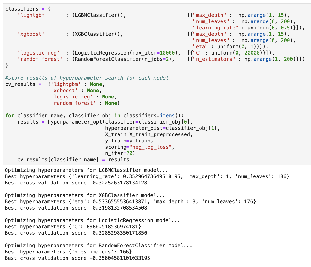
To train the four separate machine learning models, namely, the logistic regression model, the two gradient boosted trees (Light GBM and XGBoost) and a random forest, I created a function which optimized selected hyperparameters, using log-loss as the evaluation metric. With each model optimized, I then made predictions on a validation set, and once again, compared the performance in terms of log loss. The results of the hyperparameter optimization and validation set performance are shown below.
Hyperparameter optimization results:
Validation set results:
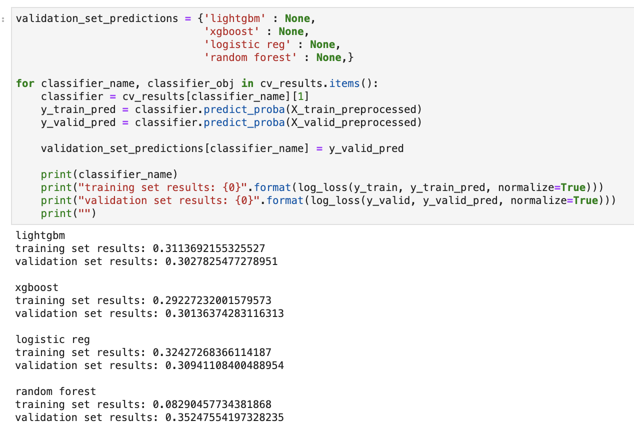
We can see that the optimized gradient boosted trees and logistic regression models performed similarly on the validation set. Out of curiosity, I therefore decided to take the model training one step further, and produce an ensembled soft-voting classifier with these three models. I simply used the individually optimized models, trained them on the training set, and made predictions on the validation set, as before. This yielded a slightly improved log loss, as seen below, though its hard to say whether the marginal improvement is significant.

A closer look at the models
Feature interpretation
The real interesting insights come when we look at where the models’ decisions come from. Let’s start with the logistic regression model. I used the eli5 package to visualize the feature weights.
Logistic regression feature interpretation:
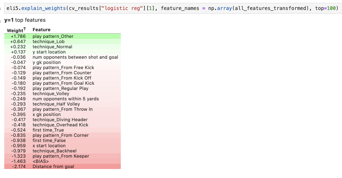
Without going into too much technical detail, the weights in a logistic regression model essentially tell us by how much the odds of a success (in this case, a goal) change for unit increases in the associated feature. Positive weights mean that unit increases in a feature increase the odds of a goal, and negative weights decrease the odds of a goal. Here, we see that, unsurprisingly, the distance from which the shot was taken has the largest effect on the probability of scoring. On the other end of the spectrum, play_pattern_Other, ie., a penalty, increases the odds of scoring more than any other variable considered. Other intuitive results that arose are that taking a shot with a backheel, from a corner, or with an overhead kick decrease the odds of scoring compared to shooting with a lob or normally.
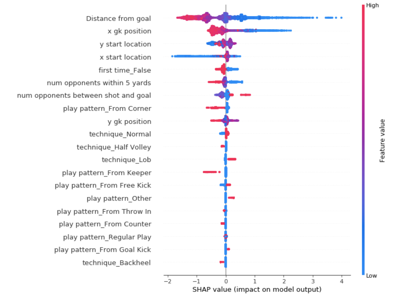
Next, let’s look at one of the tree based models - XGBoost. These type of models are notoriously difficult to interpret but luckily, the SHAP package offers a novel solution to model interpretation. SHAP uses principles based on game theory to determine the effect of each feature on the odds of a success. Essentially, SHAP considers how much the odds change when adding / removing a given feature from the model. In the visualization below, we can see that SHAP determined that high values of “Distance from goal” push the odds of a goal in the negative direction, ie., decrease the chance of scoring. The opposite is true for low values of “Distance from goal”. Another interesting insight is that large values of “num opponents within 5 yards” decrease the odds of scoring, while small values increase the odds. This makes sense since it’s harder to score when there are many opponents near the ball when taking a shot.
XGBoost feature interpretation:
Specific shots
Let’s now look at the xG values that the models predicted for specific shots. In particular, let’s look at the largest and lowest predicted values. The first plot below shows the shots with the four largest xG values predicted by XGBoost.
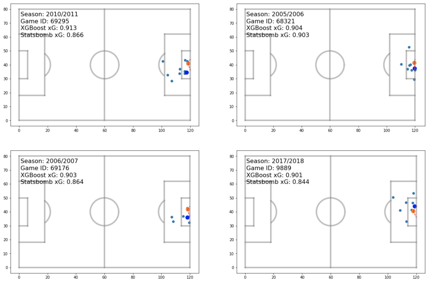
We can see that all these shots were taken from very close range with the goalkeeper (the big blue dot) out of position. This follows the SHAP plot we saw earlier for the XGBoost model, where distance from goal and goalkeeper position ranked first and second in impact on output value. Also shown in the plot here are the Statsbomb xG values. These come with the raw json data files, and we can see that our values agree reasonably well with theirs, though it would appear that the XGBoost model may be slightly overestimating the xG.
Next, we can look at the lowest xG values predicted by XGBoost.
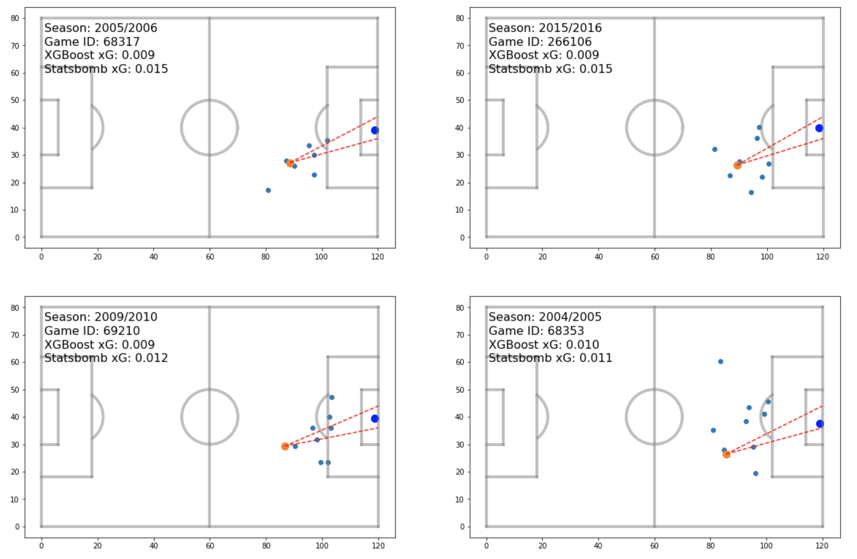
The shots in the plot above are all taken from long range with defenders either near the ball, or infront of the shot location. This makes sense intuitively, and again, the XGBoost model’s values agree quite well with those given by Statsbomb.
Comparison with the Statsbomb model and possible improvements
The figure below shows the xG values predicted by the XGBoost and Logistic Regression models plotted against Statsbomb’s values.
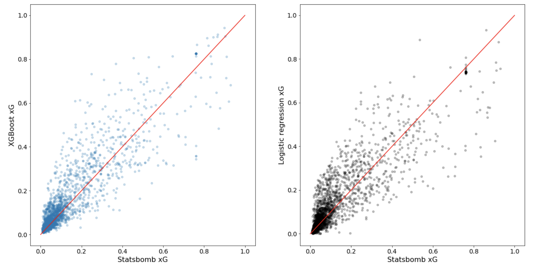
We can see that our values have quite a large spread around Statsbomb’s. However, it is important to keep in mind that the models were trained on only Barcelona’s La Liga data from 2004-2016 (roughly 10 000 shots), whereas Statsbomb’s model was likely trained on a much larger data set. Feeding more data into our models would certainly improve performance. However, there are other improvements that could be made outside of this. An obvious improvement could be to engineer better features. We could consider the log of distance, for example, since we saw in the EDA that the relationship between goal scoring rate and distance appears to be non-linear. We could also do something fancier with the goalkeeper’s position coordinates, such as quantify the degree of departure from an assumed optimal position. Another idea would be to not only consider the number of players near or infront of the ball, but also take into account their distances from the shot location. All these ideas, and many more, could improve our model, and may be implemented in the future.
Conclusion
The xG models discussed in this blog post performed reasonably well given the data they were trained on. While many improvements could be made, we saw results that made sense based on what we think we know about soccer, which is a nice sanity check. As a final thought, xG models like the ones created here are extremely powerful tools that help bring objectivity to the analysis of soccer games, and examples of such analyses will follow in future blog posts.